Image
Astro-only component
Starwind’s Image component wraps Astro’s image optimization APIs and is only available in Astro. In React or Vue, use your framework’s image component, or a native <img> when framework-level optimization isn’t needed.
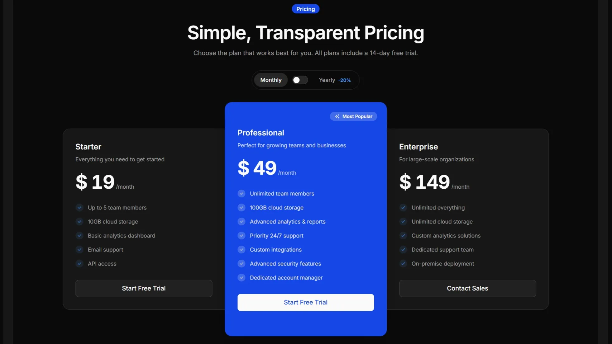
---import pricingImage from "@/assets/images/pricing-9.jpg";import { Image } from "@/components/starwind/image";---
<Image src={pricingImage} alt="Pricing illustration" class="rounded-lg" />
Installation
pnpx starwind@latest add image --framework astronpx starwind@latest add image --framework astroyarn dlx starwind@latest add image --framework astroUsage
---import productImage from "@/assets/product.jpg";import { Image } from "@/components/starwind/image";---
<Image src={productImage} alt="Product on a desk" class="rounded-lg" />
Optimization
The Image component is a thin wrapper around Astro’s built-in <Image /> component. It provides:
- Automatic size inference:
inferSizeis enabled by default, so you don’t need to specify width and height for remote images - Responsive defaults: Images are set to
w-full h-autofor responsive behavior - Optimized output: Leverages Astro’s image optimization pipeline
Remote URL
You can use remote URLs directly. For deterministic builds, provide dimensions and disable remote size inference.

---import { Image } from "@/components/starwind/image";---
<Image  src="https://images.unsplash.com/photo-1588345921523-c2dcdb7f1dcd?w=800&dpr=2&q=80"  alt="Sleek gray design"  width={800}  height={533}  inferSize={false}  class="rounded-lg"/>
API Reference
Styled Component API
These props are added or materially changed by the installed styled component. Standard HTML attributes remain available through the inherited interfaces noted below. Expand a prop to see named type definitions and framework-specific imports. Follow the Primitive and Runtime links for lower-level behavior props.
Image
Inherits Partial<import("astro/types").ComponentProps<typeof AstroImage>>.
Contains the following additional props:
inferSize boolean true
- Description
- Infers missing image dimensions from the source when possible.
- Classification
- Wrapper prop
Changelog
View version history v1.1.0 3 releases
v1.1.0
- Moved Image to contract-generated Astro registry output while preserving its
astro:assetsintegration; Image remains Astro-only.
v1.0.2
- Refactor tailwind variants functions into separate
variants.tsfile
v1.0.0
- Initial release with starwind v1.13.0